Windows Application Information, Security Rating and Removal Guides
Windows Application Information, Security Rating and Removal Guides

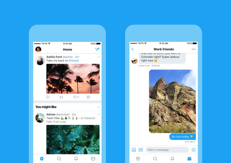
Twitter has been faced criticism and feedback for a long time for the unfriendly design of the website and mobile applications, and now it finally rolls out a new look which making it easier and faster to use.
Complex interface and use of the website and mobile applications are usually criticized by the Twitter users, and now, this social network takes actions to do some changes for troubleshooting the problem based on people’s feedback, and this is the reason for publishing the new look about the site and the mobile apps. Here are some improvements of the new look you would like:
This Twitter’s new look will be available from June 15, the microblogging service will be simplified significantly from the new interface, according to the social network.


Comments
Leave a reply